
UI Documentation with Storybook: A Beginner’s Guide to Getting Started

First off, what the heck is Storybook? From the official docs,
“Storybook is a frontend workshop for building UI components and pages in isolation…teams use it for UI development, testing, and documentation”
Keywords: documentation and testing.
Documentation:
It is not uncommon to have a component that renders differently based on the props it receives. Storybook is a great way to let users of this component test interactively.
Also, let’s say you have to make a change to a common component used in various places in your app. Writing integration/unit tests for these components could ensure functionality stays intact. However, the UI (alignment, spacing, etc) could still be broken.
If these components have “stories”, we can quickly look at the stories to ensure we are not breaking the UI.
Testing:
Storybook also works well with testing tools like React Testing Library (I will cover this in subsequent articles). It is rather convenient that a component can serve as both the documentation and test subject of your UI component.
Click here to learn how to write tests using Storybook.

Let’s create a new React project.
Run the following:
npx create-react-app storybook-starter && cd storybook-starterWe will be using the npx @storybook init command to create all the necessary configurations.
NB: the preceding storybook initialization command will only run on an existing project.
Run:
npm run storybook
Also, in your project, you should see a new stories directory.
We will be investigating the Button.stories.tsx file:
src
  | - stories
      | - Button.stories.tsx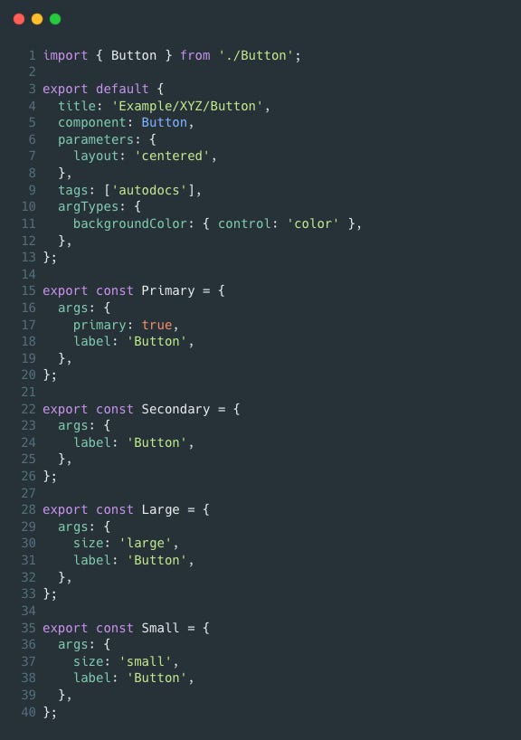
Let’s look at the default export.
title (optional): an optional parameter that tells Storybook two things — how to list your component and what name to call it. Consider it to be similar to a route path. Additionally, if you do not provide it at all, Storybook will use file system-based routing to list your stories.
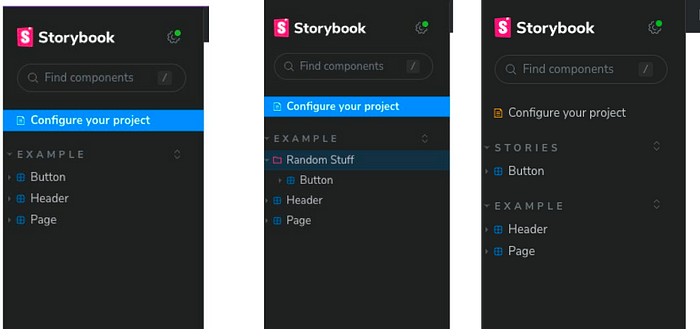
Go ahead to change the title to "Example/Random Stuff/Button" .
This should be the result, before and after the change:
component (required): The component we want to document, in this case, Button
parameters (optional): they tell Storybook how to render your component(s) in the canvas. The layout parameter has three options: centered | fullscreen | padded
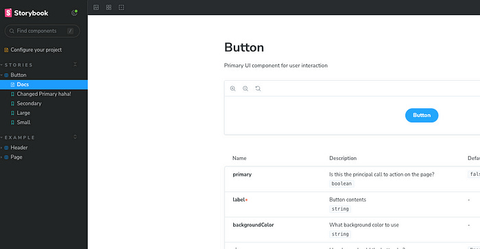
tags: [‘autodocs’] (optional): this is a very handy way for Storybook to automatically generate documentation for you like so:
argTypes (optional): the argTypes defines the type(s) of values that can be passed to the args (don’t worry, we will look at the args next).
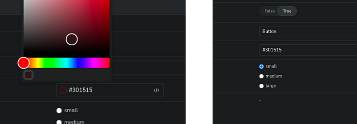
In the above sample code, the backgroundColor has been set to use the colour control by Storybook. In your browser, Storybook would provide a colour picker for you.
If we were to change that to, say, a text, we would see an input field.
export default {
  ...
    backgroundColor: { control: 'text' },
  ...
};
See the full list of Storybook’s control annotations here
Now, let's look at the four named exports.
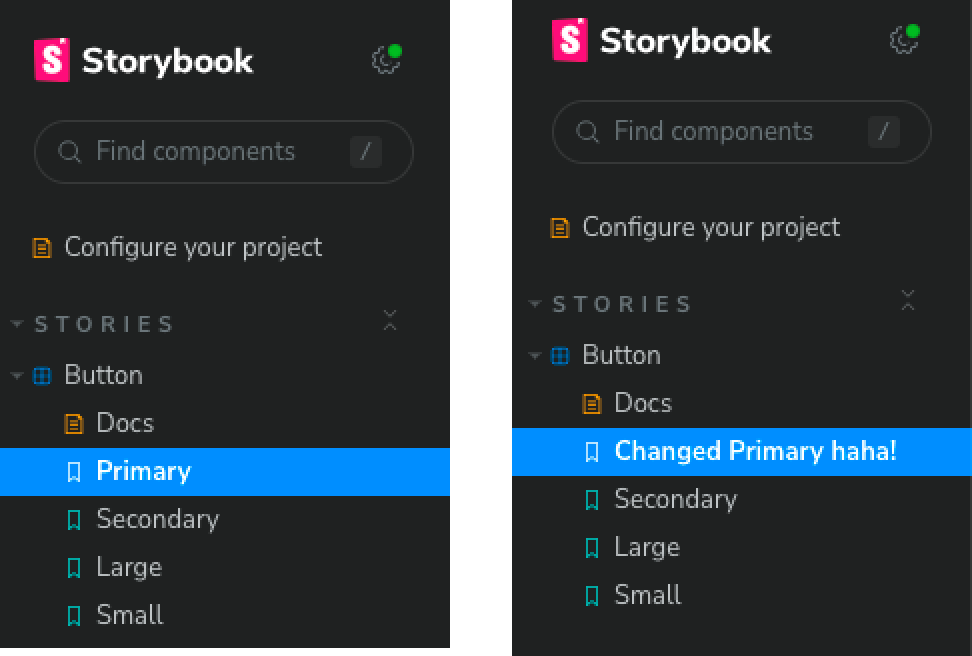
First off, you will notice that the names of the stories (“Primary”, “Secondary”, “Large”, and “Small”) match the stories on the UI.
Similar to the aforementioned title story property, Storybook automatically generates this. Like the title property, we can override this by providing a name for the story like so:
export const Primary = {
  name: 'Changed Primary haha!',
  args: {
    primary: true,
    label: 'Button',
  },
};
Now, the UI should look like so:
Finally, the args property:
The “args” simply represents the props of the component.
The src/stories/Button.tsx looks like so:
export const Button = ({ primary, backgroundColor, size, label, ...props }) => {
 ....
};
Conclusion
Well done! 🎉 You’ve reached the conclusion of this comprehensive article on getting started with Storybook. At this point, you should possess a strong grasp of the essential concepts and techniques that make Storybook an indispensable tool for both developing and showcasing your UI components.